


Trading 212 Reverts to Old Interface
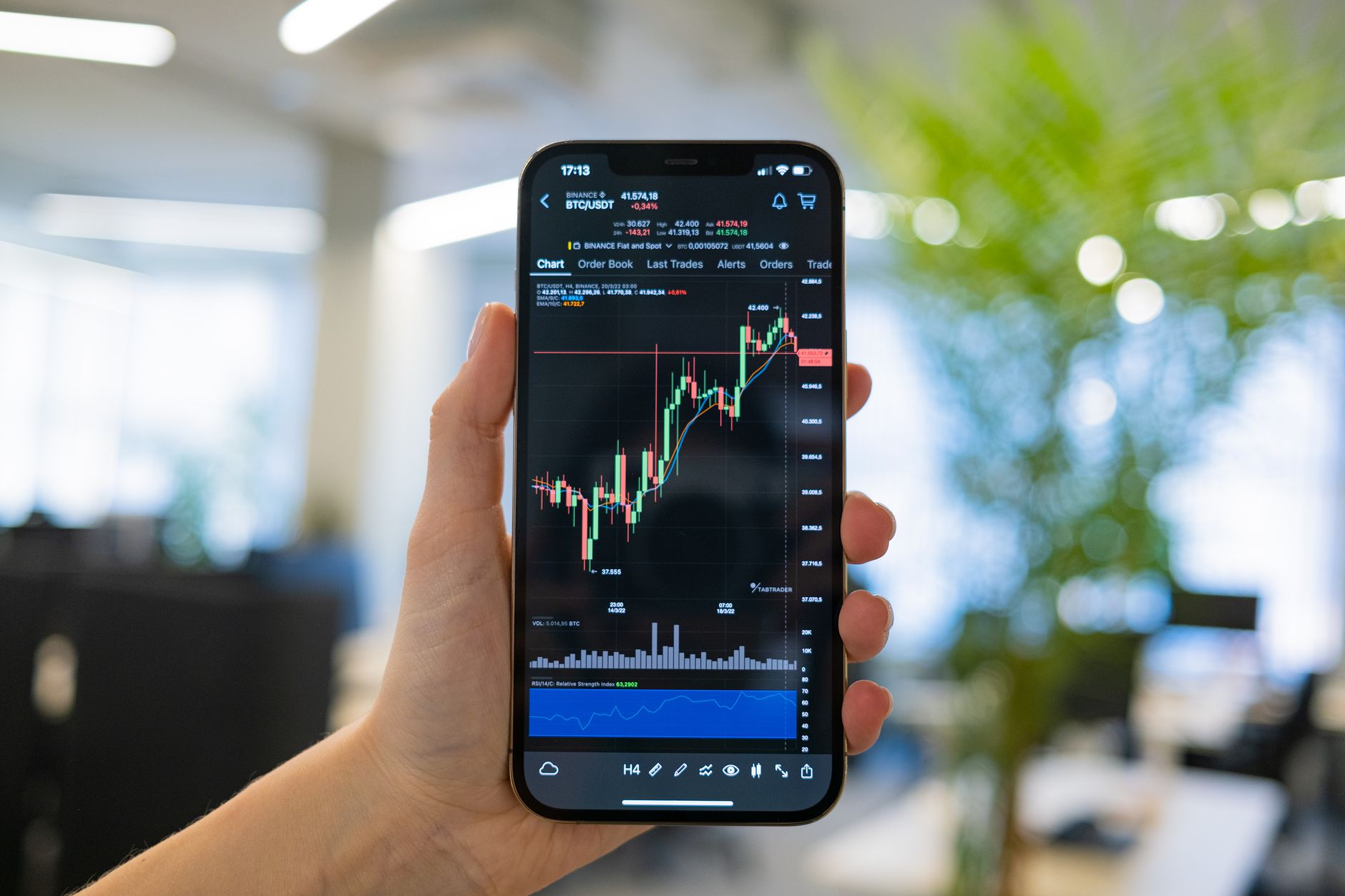
Trading 212 announced it will roll back a recent app redesign after receiving a wave of criticism from its user base.
Redesign sparked immediate backlash
The fintech firm launched a new layout in mid‑December, replacing the familiar view with a bubble‑style arrangement. Within days, the community forum was flooded with complaints, many pointing to missing data points and harder navigation.
Users reported that the portfolio value chart no longer displayed axis numbers, and pending orders omitted cash allocation details. Another grievance involved the app ignoring previously selected color themes, forcing traders to adjust visual settings each session.
One participant even created a dedicated account titled “IHateTheNewLayout” to document issues, showing the depth of dissatisfaction.
Company responds to pressure
Following the outcry, a representative known as KrisG posted on the forum, stating, “We appreciate your feedback on the portfolio redesign and understand the concerns it raised. Based on what we’ve heard, we’ll be rolling out an update in January that brings back the previous layout.”
That message came after traders warned they would consider moving to other platforms unless the interface became more functional. The firm’s decision to revert to the older design marks a rare retreat for the UK‑based broker.
Another user, identified as NakamuraRTS, wrote, “The app feels completely unserious. Who creates charts without a Y‑axis?” and added, “People are using your app to deploy their life savings. Do better in 2026.” The comment was later followed by a request for a simpler, less flashy experience.
While the company has not disclosed exact numbers, the timeline suggests the reversal was decided within ten days of the initial rollout. The swift response indicates the firm weighed the cost of losing customers against the effort required to restore the former interface.
Related: Paramount Sues Warner Bros. in Takeover Battle
Looking ahead, the broker faces the task of rebuilding trust. Restoring familiar features may appease current users, but the episode highlights the importance of testing major UI changes with a broader audience before full deployment. If similar adjustments occur, a phased rollout could help mitigate backlash while still gathering feedback.
In the meantime, the upcoming update is expected to appear early next month, though the exact release date remains unconfirmed. Traders will be watching closely to see whether the restored layout meets their expectations for clarity and ease of use.
Trading 212, known for offering commission‑free trading across stocks, forex, ETFs and CFDs, built its reputation on a straightforward, low‑cost experience for retail investors. The abrupt shift away from that simplicity sparked particular concern among users accustomed to a clean, data‑rich interface. By removing axis labels from the portfolio value graph, the redesign not only altered aesthetics but also stripped away a fundamental reference point that many traders rely on for quick performance assessment.
The community platform, where the bulk of the feedback originated, became a hub for detailed technical critiques. Hundreds of users posted screenshots and step‑by‑step accounts of how the new design obscured information that was previously visible at a glance. This volume of feedback showed that the dissatisfaction was not limited to a vocal minority but represented a widespread sentiment across the broker’s active user base.
Beyond the visual changes, the loss of cash allocation details in pending orders meant that investors could no longer verify the exact amount of capital earmarked for each trade without digging deeper into the app. For many, this added an extra layer of effort to a process that had previously been transparent and immediate, raising concerns about efficiency and accuracy during fast‑moving market conditions.
The issue of ignored color theme preferences also touched on personalization, a feature that many traders use to reduce eye strain and to align the app’s appearance with their workflow. When the redesign reset these settings each session, users felt that the platform was no longer respecting their individual preferences, which contributed to a perception of a less user‑centric product.
By publicly acknowledging the backlash and committing to a January rollout that restores the prior layout, Trading 212 signaled a willingness to prioritize user experience over unchecked innovation. This decision may serve as a reference point for other fintech companies contemplating major UI overhauls, emphasizing the need for iterative testing and responsive communication with the community.

Paramount Sues Warner Bros. in Takeover Battle


